Walht: To write a survey using Google form and use the survey results to create a graph and analyse data to make a pie graph.
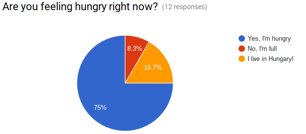 This graph says that most of the children in Room 8 were very
 hungry and only one person was full when they were answering this question.
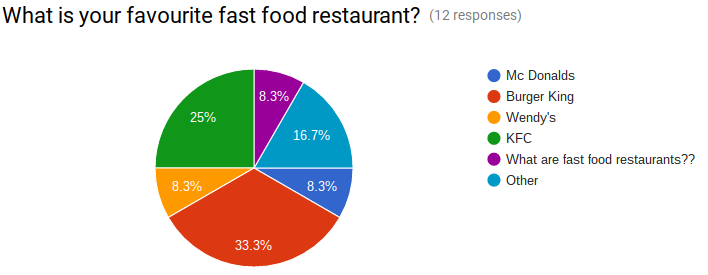
This graph shows me that Burger King is the most popular fast food restaurant and the most unpopular one is Wendy’s.
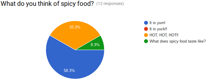
This graph says that 7 out of 12 people think that spice food is yum and 1 person doesn’t know what spicy food taste like.
Well done, I can see that you can collate data from a survey and use the electronic tools to display those results. You concise summaries demonstrate the use of critical thinking skills as you analyse and form statements about what that information tells you. Well done
ReplyDelete